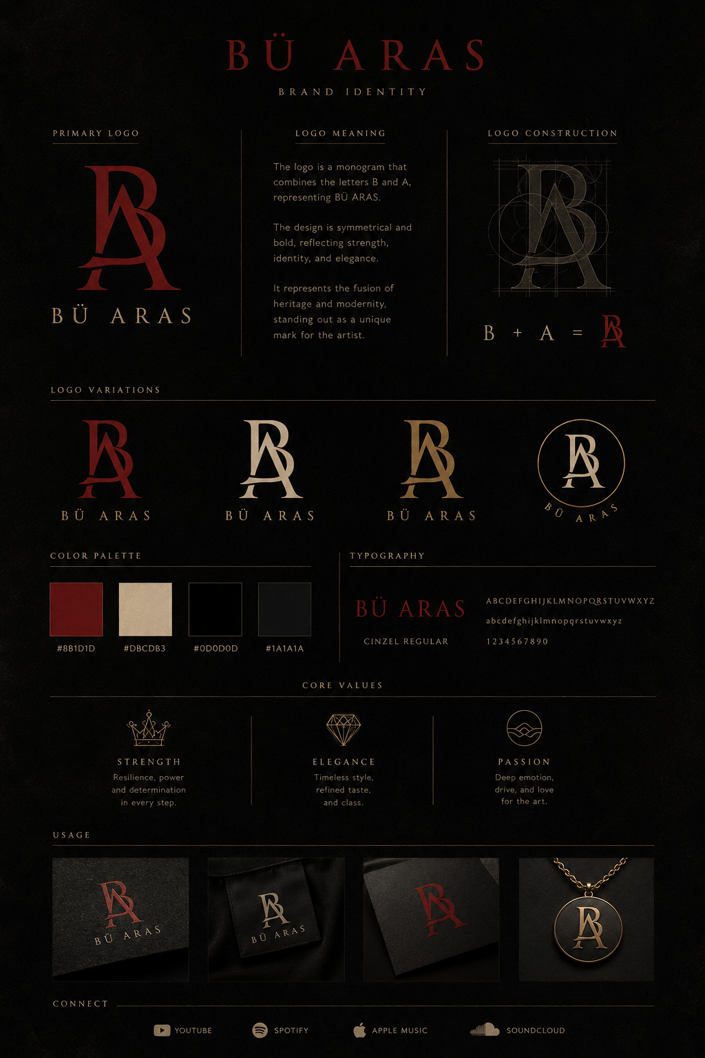
The Mark
Story of the Logo
A logo should do more than identify a brand — it should tell a story.
Three Elements
Monogram. Compass. Gold.
The BÜ ARAS emblem is built around three defining elements, each representing a chapter of my journey and the values that shape everything I create.
Origins
Where It Started
Every mark carries a history. The BÜ emblem began as the BA monogram — the first signature of the brand, rooted in identity and ambition.
The Original Mark
BA Monogram
The first signature. Bold, symmetrical, and unmistakably personal — the B and A intertwined as one.
The Current Emblem
BÜ ARAS
Refined into a compass-guided monogram. The umlaut honours heritage; the gold finish signals earned purpose.
01 — The Monogram
BÜ.
At the centre is the BÜ monogram — a minimalist fusion of my artist name. It's clean, timeless, and intentionally understated, reflecting the balance between strength and simplicity.
The umlaut over the Ü is a nod to my identity and heritage, making the mark instantly recognisable wherever it appears.
02 — The Compass Star
My North Star.
The compass star is the soul of the brand.
Its origin traces back to 18 October 2021 — a date that forever changed the direction of my life. Inspired by Natasha Molyneux, the compass became a personal reminder that even when everything feels uncertain, your purpose can still guide you forward.
It is my North Star — a symbol that every decision, every song, and every creative project should point toward authenticity.
01
Direction
Staying true to who I am.
02
Resilience
Finding strength through adversity.
03
Growth
Embracing every chapter of the journey.
04
Purpose
Creating with intention rather than expectation.
03 — The Gold Finish
Earned, not loud.
The champagne-gold metallic finish represents earned value rather than luxury for its own sake. It symbolises refinement, craftsmanship, and creating work with lasting meaning.
Against a black background, it reflects the idea that light is most visible after darkness.
More Than Music
A constant reminder of where the journey began — and where it's heading.
Although born through music, the logo was designed to extend beyond it. Whether it appears on album artwork, live productions, fashion, fragrance, or future creative ventures, it remains the same mark, the same promise.
Create fearlessly.
Stay authentic.
Keep moving forward.
BÜ ARAS · Dark Pop · Eastern Pulse · Unfiltered Energy